Understanding digital mapping for better route planning and travel habits
By Jeff Deems
In recent years many low cost digital mapping tools have emerged, bringing data sets that used to be squarely in the domain of specialists with expensive software into widespread public use. It is now common for backcountry riders to plan routes in advance, with distance measures, slope angles, forest cover, land ownership, and other relevant data, or to navigate in real time and revisit or share completed tracks. In some cases, these tools are linked with guidebook information and/or crowdsourced route content. Use of these tools is regularly integrated into avalanche education courses.
But, as with any tool, they have limitations—and in this case the limitations are not obvious and may even be hidden by implied precision.
Unfortunately, digital terrain information appears to have played a role in recent avalanche accidents by steering users into unintended exposure. Due to the nature of this digital terrain information, and the manner in which we tend to interact with these tools, this factor likely occurs frequently but without obvious consequence.
In this context, it is worth asking a couple questions to explore the potential pitfalls and proper use of these interactive digital maps:
Are we making accuracy assumptions when using digital mapping tools?
Are there best practices which will help us use these digital mapping tools more effectively?
The Digital Elevation Model
All of the current route-planning apps have one thing in common: they exploit digital models of terrain.
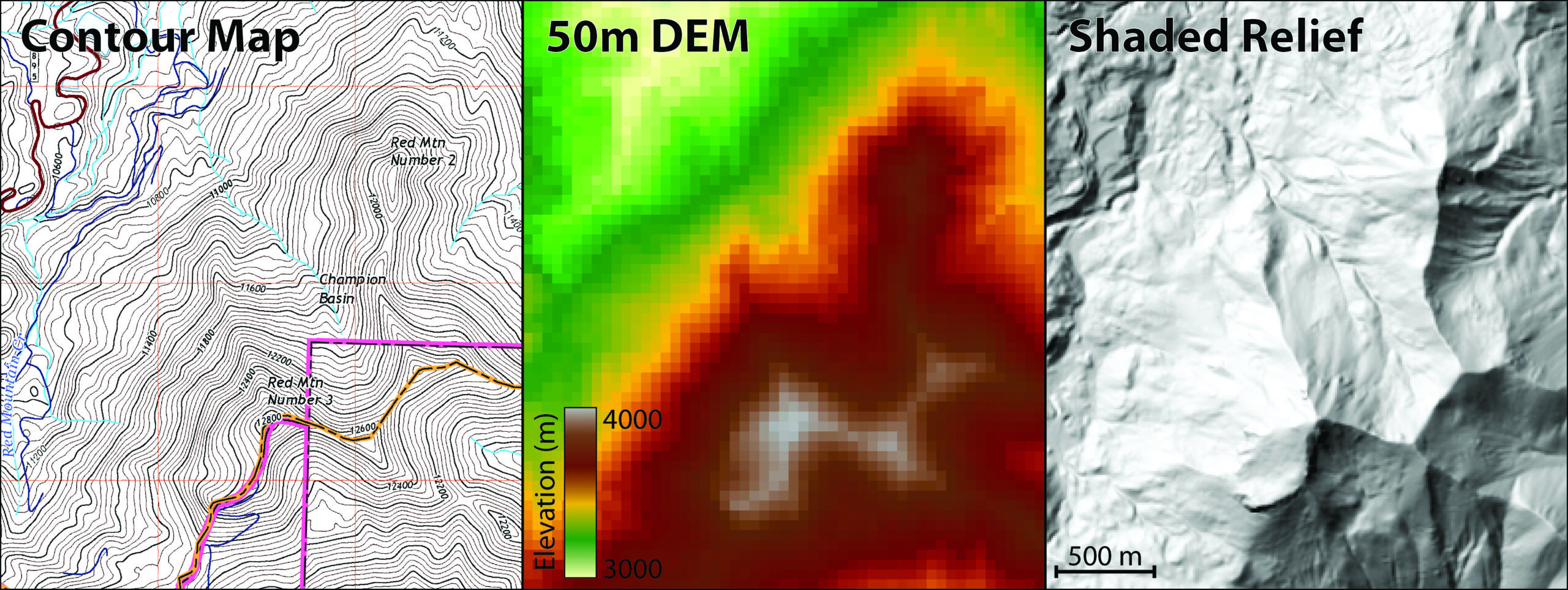
There are a number of ways to display and convey terrain elevation in digital mapping, and they have evolved over time from flat paper maps to modern digital data sets in concert with measurement methods and display technology. Older maps used artistic techniques like hachures to convey relief in a semi-quantitative way, and were largely replaced by contour maps, which more accurately quantify elevation and relief, with each contour tracing a line of equal elevation. These days we are accustomed to interacting with digital elevation maps and shaded relief to convey elevation in a software environment that allows us to exploit multiple data sources at once (Figure 1).
This digital source—the Digital Elevation Model or DEM—is the fundamental data set for terrain analysis. This data format is Digital—the information is stored electronically; it stores terrain Elevation information—the land surface height above some reference elevation like sea level; and most importantly, is a Model—an abstraction or representation of reality, in this case typically arranged in a regularly-spaced grid. The statistician George Box provided probably the most eloquent summary of the topic here when he famously stated: “All models are wrong, some are useful.”
There is utility and power for us in knowing more about ways in which these models can be wrong, so that they can be most useful to us in managing avalanche danger.
Not all terrain models are created equal. The method by which a specific DEM was created depends on its date of creation and what source data was available. Elevation source data can be collected from field surveys, airborne or satellite camera imagery, or active remote sensing techniques like radar or lidar. Until the advent of computerized mapping tools in the 1980s and 90s, the predominant elevation resource in the United States was the 7.5’ quadrangle map series, produced by the US Geological Survey through analysis of overlapping aerial photographs. Using a device called a stereoplotter, a technician would manually trace lines of equal elevation—contour lines—to produce each paper quad map. Most DEMs available today through the US National Map are these same data—created by digitizing the paper 7.5’ quad maps, and interpolating the contour line elevations to a regular, 30-meter grid—one elevation value every 30 meters. These 30m data sets have since been re-interpolated to a seamless 10m data set, and this is the DEM source most widely available in the continental US.
Beginning in the early 2000s, several space missions provided globally available elevation data. The ASTER sensor on NASA’s Aqua and Terra satellites produce 90m resolution elevation models from stereophotos, while the Shuttle Radar Topography Mission (SRTM) produced 90 and 30m DEMs using radar interferometry. Though they have been improved by recent reprocessing, these DEMs have specific shortcomings in forested or rough terrain and should be treated with caution at fine scales.
DEMs generated these days are commonly based on remotely sensed lidar data or on high-resolution satellite photos, either of which allow 1- or 2-meter resolution terrain data to be generated at high accuracies. Lidar has the additional advantage of being able to map under forest canopies, producing ‘point clouds’ of elevation measurements of the forest and the bare surface. These point clouds are then aggregated to a DEM, and provide an accurate reference against which to evaluate the more commonly available data sets.
Because of this variety of elevation measurement technology, digital mapping techniques, and sensor resolution, DEM accuracy varies by location. Different techniques and measurements have varying ability to map surface elevation in complex terrain or under forests. Errors also result from the digitization and interpolation methods. Additionally, terrain features that are smaller than the grid size can be missed (more on that in a moment). The end result is a complex and spatially variable pattern of elevation errors and data quality. These errors can present as a bias, as systematic errors, or as spatially correlated errors—separately or in combination. Importantly, it is not obvious to a digital map user which data source is in use, or what the DEM accuracy might be in a specific area.
In most of the continental US, the most widely available DEM is the 10m NED DEM, digitized from pre-1979 topo maps, and while some specific areas have been mapped with lidar, even those lidar resolutions vary from 1 to 5 m depending on the technology used for the survey. High-res lidar coverage is increasing steadily due to USGS 3DEP and FEMA floodplain mapping programs, so the data availability is continuously evolving. Alaska typically has lower-resolution DEMs, with 30m SRTM DEMs being the current standard, though the USGS is currently building out a 5m radar DEM. Globally, the mix expands further, adding national mapping programs with similar technique, resolution, and accuracy variations as we have in the States.
Slope Angle Maps
When the concern is with navigating and route-planning in avalanche terrain, slope angle is the terrain feature of primary interest rather than simply elevation values. Slope angle is defined as the change in elevation (Rise) divided by the distance over which that change occurs (Run).
Rise divided by Run and a little trigonometry gives us the slope angle, which is typically derived for each grid cell in a DEM data by considering the local neighborhood at each cell. Solving for the maximum elevation change within the 3×3 block of grid cells surrounding the target cell gives us a magnitude and direction of slope for that cell—the magnitude being slope angle and the direction being slope aspect.
At this point DEM errors and limitations start to come into play. Errors in the DEM and the ability of the DEM resolution to capture the terrain variations can combine to compound errors in slope angle estimation. Thus there are two primary sources of error when producing slope angles in DEMs: elevation errors in the DEM, and impacts of DEM resolution. With resolution, we are concerned with the size of each grid cell compared to how rough the terrain is. If the terrain changes elevation substantially over, for example, 5 meters of distance, but our DEM can only capture values every 30 meters, then a lot can happen on the terrain between elevation measurements.
The profiles in Figure 2 illustrate these resolution effects. If we calculate slopes between the grid cell centers (red lines) it is clear where slope angles are underestimated, and the peaks and valleys get clipped. Some of that detail can be estimated by doing a better interpolation (making curves instead of straight lines), but that is effectively an informed guess, with unquantified impacts on slope angle accuracy.
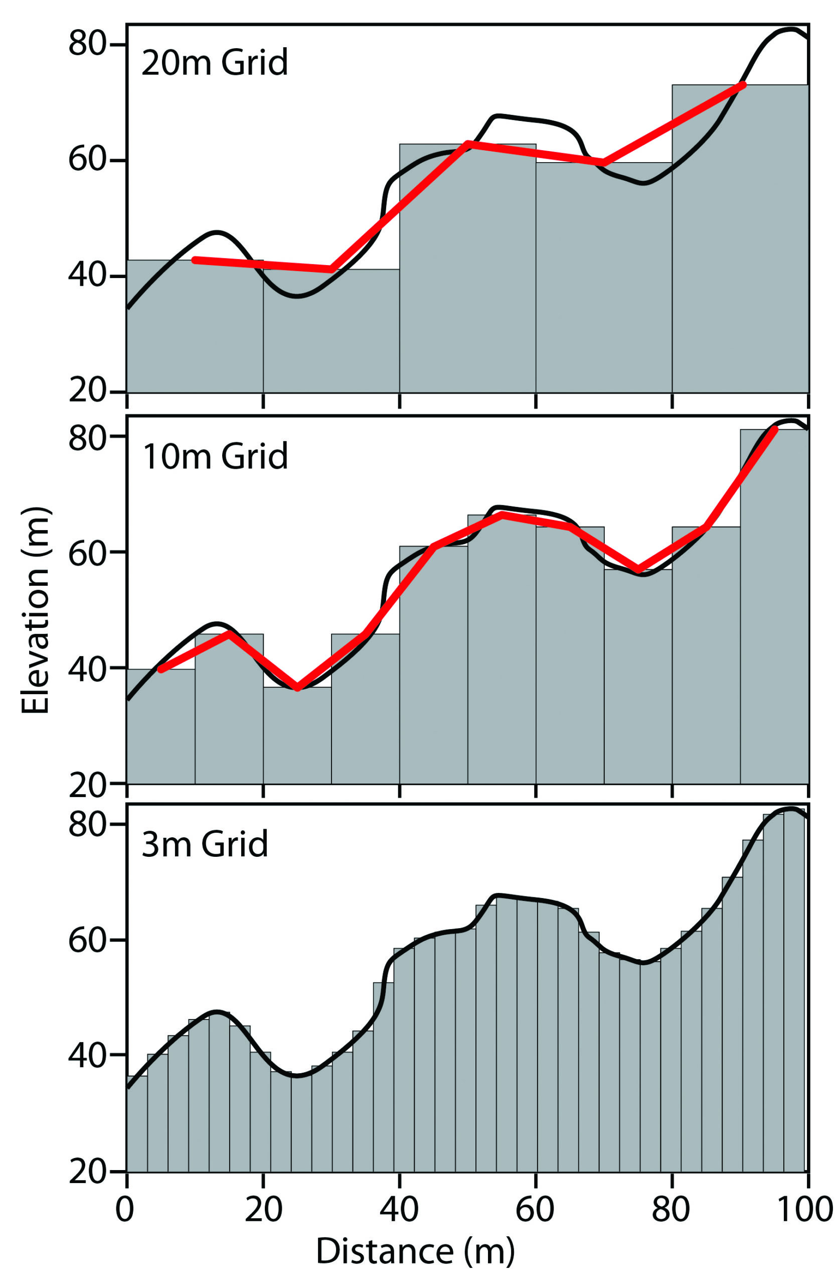
A look at overall statistics of elevation and slope across a DEM at different grid resolutions shows that the average values for elevation and slope don’t change much with a coarser grid, but the max and min elevations get smoothed off. And most importantly, the maximum detectable slope angle decreases dramatically. THIS IS IMPORTANT—with coarser elevation models, our ability to detect and map steeper slopes goes away.
The perspective views of two different DEMs and their respective slope angle maps in Figure 3 demonstrate the level of detail and in the steepness of individual terrain features. It is clear that even with this relatively small resolution change from the 10m USGS DEM to a 3m lidar DEM, there is a dramatic difference in the ability to capture the slope steepness, as well as smaller terrain features.
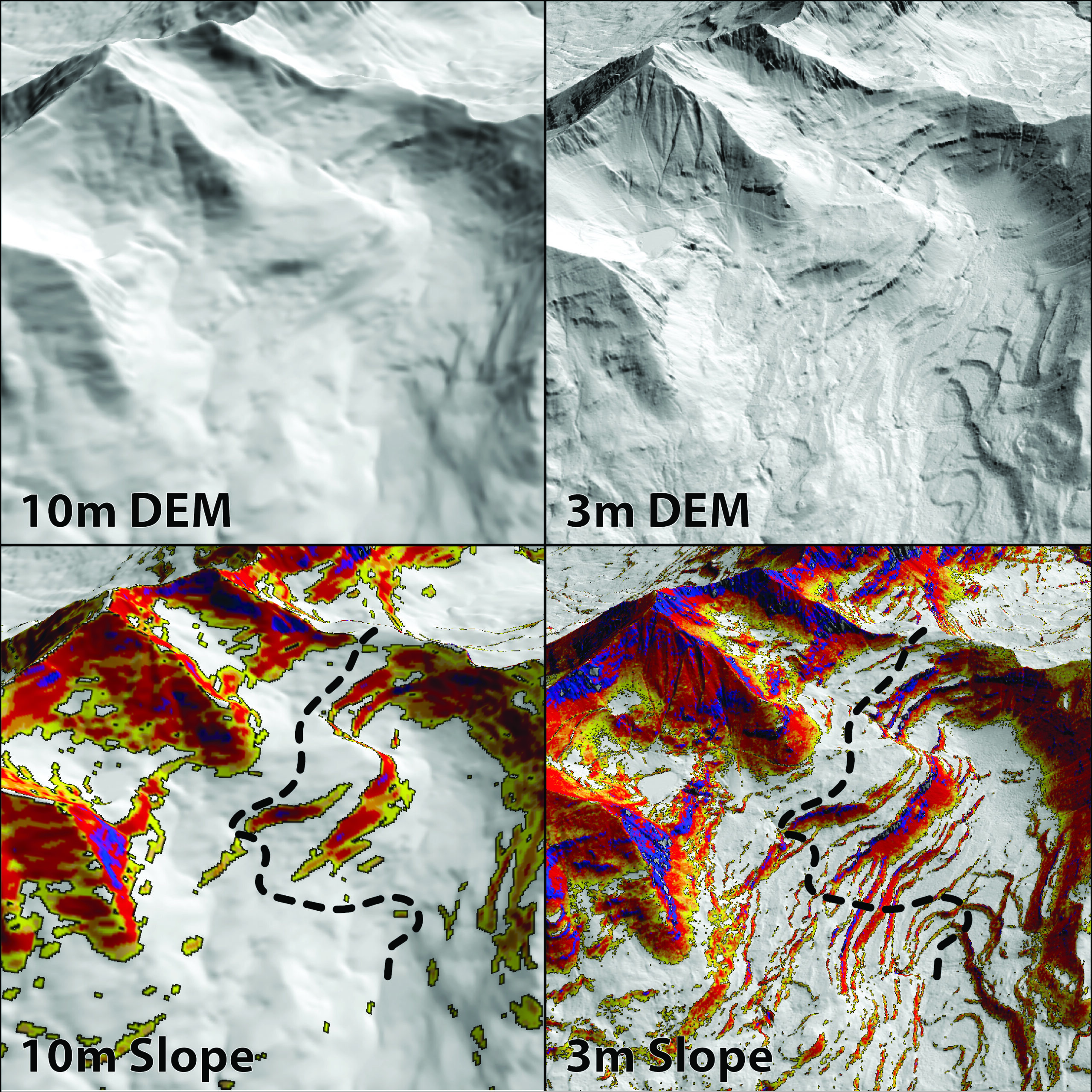
Imagine that we are using the 10m data set to plan a route (dotted line). Ignoring for a moment whether it is a good idea to travel under all of the potential overhead hazard, the route itself attempts to exploit lower-angle ramps in the terrain to gain the ridge—at least according to the 10m data. Plotting the same line on the higher-resolution map, suddenly the route is crossing a bunch of short, steep, slopes that are not evident in the coarser data set. In some terrain, features like this might be easily avoidable by the alert routefinder, but in other terrain intricate route planning may result in unwitting commitment to avalanche hazard exposure.
Even though a higher resolution model tends to be a more accurate representation of the terrain, we can still use a coarser data set as a guide and tool for planning and navigating. The key is understanding how and where elevation model information can be incomplete: in complex or forested terrain, on features close in size or smaller than the DEM resolution, and in steeper areas. This description sounds a lot like terrain traps, and also describes small features that can be trigger points, or areas that may look like islands of safety but are not in actuality. By adding safety margin to accommodate these uncertainties, we can use the valuable information present in the DEM without inadvertently increasing exposure.
Converging on Best Practices for Digital Mapping
To summarize the primary ways in which digital terrain models can fail us:
- Small terrain features are often not captured by DEM
- Errors in DEM could omit, create, or mis-represent the size and shape of terrain features, due to forest cover, steeper slopes, & complex terrain
- Digital slope angle is likely low-biased
In addition to these issues, the digital mapping tools in common use struggle to communicate the level of uncertainty in the underlying data—partly due to the nature of digital mapping tools in general (not specifically the data they use)—in that there is an implied or assumed accuracy in the digital format that can be misleading. The fixed scale of paper maps allows an intuitive sense of distance and the size of terrain features, however the rapid scale changes possible with digital mapping foster a dependence on the tool, and provide no corresponding visual cue that the accuracy may not support use of the data at that scale.
Further, our decision-making process must allow for compounding & interacting errors. For example, in addition to terrain model and slope angle errors, there is uncertainty in GPS positioning and therefore in our knowledge of our location in the terrain. Encountering these uncertainties when fatigued, in white-out conditions, or with a less-skilled or injured partner can pose serious problems.
Putting this information into practice, use of digital mapping tools can fit right into our existing uncertainty paradigm in evaluating avalanche danger and traveling safely. Knowing how digital data are produced can inform their use & weak points. In our route planning & decision-making processes, we can treat terrain analysis in the same manner that we treat stability assessment—acknowledging inherent uncertainties, leading us to incorporate wider margin into our route planning process. For example, narrow, lower-angle gaps in the slope angle shading may be enticing, but those features may not exist, and they may be connected to surrounding, steeper slopes.
On the positive side, digital terrain data and planning tools provide a wealth of information to exploit. Regardless of the specific slope angle accuracy, the presence of overhead hazard can be anticipated. Often, an indication of the relative terrain steepness can be extremely useful—focusing on mellower or steeper rather than the specific slope angle. Digital mapping apps can add photos showing forest density or rock outcrops, which can be just as important for travel as the terrain itself. While micro-routefinding requires constant field awareness rather than app-dependence, macro- scale planning is greatly aided by digital tools.
As with stability assessment, we can plan our route, then continually re-assess and be nimble enough to alter that plan when what we observe on the ground doesn’t match our expectations. While looking for signs of instability, we should simultaneously be evaluating terrain features with a keen eye and our trusty inclinometer, recognizing in the same uncertainty context that the expected snow structure and the expected slope angles may be different than the forecast or our digital tools indicate. Our minds will tend to focus on what the visual tool shows, not what it doesn’t show or what it implies. Active questioning is imperative to overcome this trap—does that narrow line on the map really distinguish safety from danger, or do we need more information?
By getting our heads out of our phones and actively looking for ways the terrain is different from what our digital planning suggested, we can reduce our likelihood of being surprised by the terrain.
Rules of Thumb are rarely appropriate in the avalanche world, but here’s one that might keep us out of trouble: it’s probably steeper than the slope map says.
Resources and Further Reading
- US Geological Survey DEM product availability
- NASA Shuttle Radar Topography Mission
- ASTER Global DEM
- Hengl and Evans, 2009. Mathematical and Digital Models of the Land Surface, in Developments in Soil Science, Volume 33, DOI: 10.1016/S0166-2481(08)00002-0.
- McCollister, C., and K.W. Birkeland, 2008. “Using GIS for avalanche work” The Avalanche Review. 24-4
- Scott, D., 2009. “Avalanche mapping: GIS for avalanche studies and snow science” The Avalanche Review 27-3
Emerging from the legendary ski town of San Diego, Jeff Deems’ skiing habit was solidified in Colorado mountain towns. Degrees from Montana State and Colorado State added a small measure of legitimacy to that pursuit. As a researcher at the National Snow and Ice Data Center at CU Boulder, and a co-founder of the Airborne Snow Observatory, Jeff studies spatial variability in snow properties.